top of page
THE BRAND
robert burns whisky
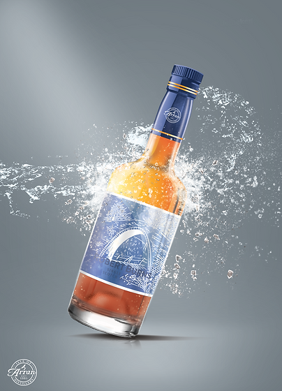
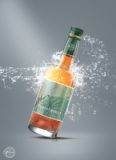
Set by the Drinking Cabinet back in 2017 to redesign the packaging and brand identity for their Robert Burns Whisky. In order to hit the younger demographic who steer away from whisky based drinks, the design went for an organic take. It took various well-known work from Burns and developed them through hand drawings and water colour. It was then called to create a small piece of promotion for the beverage. Three concepts were generated that could potentially be shared throughout the year at various points.


bottom of page